Reserve Bank of Zimbabwe. Self-scan by Marianian followed by minor Photoshop enhancements to improve appearance and reduce size.
The 2009 Zimbabwe $100 trillion banknote.

Unit 7 Macroeconomic policy in the global economy

How some countries still suffer from high inflation, while many others seek to control it by fixing—or managing—the exchange rate, and all are constrained by global financial markets

Before you start

This unit builds on the modelling and analysis of inflation, unemployment, and macroeconomic policy in Unit 5. If you have not already worked through Unit 5, you should read, at a minimum, Sections 5.2 to 5.4 on the role of fiscal and monetary policy, Sections 5.9 and 5.10 on monetary policy and inflation, and Sections 5.13 and 5.14 on the domestic and exchange rate channels for the transmission of monetary policy.

7.1 Chainsaws, government spending, and inflation

In 2022 and 2023, Javier Milei, a candidate in Argentina’s presidential election, campaigned with a revving chainsaw in hand. As he travelled the country, he was sometimes welcomed by supporters waving their own chainsaws in the air.

Javier Milei was elected president in November 2023 and embarked on what he called his Chainsaw Plan—his blueprint for slashing public spending.
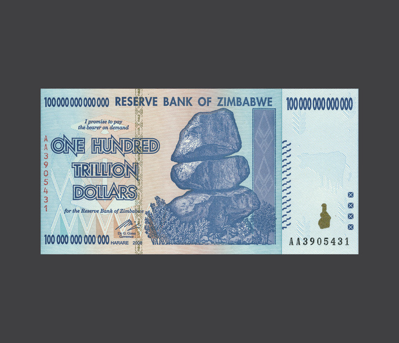
hyperinflation
Economists usually define hyperinflation as a monthly inflation rate of more than 50%. In such situations, a unit of currency loses more than 99% of its real spending power within a year.

Milei was not the first president of Argentina to try to reform the country’s economy. In the 1920s, it was one of the richest countries in the world. But since then Argentines have lived through decades of economic instability and high inflation, including periods of hyperinflation, as shown in Figure 7.1. 

In this line chart, the horizontal axis displays years from 1960 to 2025. The vertical axis displays Argentina’s CPI inflation rate, ranging from -10% to 100%. The inflation rate fluctuates significantly over time. Starting around 20% in the early 1960s, it dips to around 8% in the late 1960s before it steeply rises to over 100% in the mid-1970s. After a brief decline in the early 1980s, the rate spikes again, surpassing 100% again between the early and mid 1980s where it falls back to around 80%. A similar spike takes place again from the mid 1980s to early 1990s, where there is a sharp drop to negative levels from early to late 1990s. There is a spike in inflation in the early 2000s, from around -1% to 40% and back down to 4%. Inflation then starts slowly rising again, before spiking in 2020 and peaking above 90% by 2023.
Fullscreen
https://www.core-econ.org/macroeconomics/07-macroeconomic-policy-global-economy-01-government-spending-inflation.html#figure-7-1

Figure 7.1 Argentina’s CPI inflation rate (1960–2023).

Timothy J. Kehoe, Juan Pablo Nicolini, Thomas J. Sargent, ‘A Framework for Studying the Monetary and Fiscal History of Latin America’, 1960–2017. Federal Reserve Bank of Minneapolis.

Argentina’s inflation rate exceeded 100% per annum: In this line chart, the horizontal axis displays years from 1960 to 2023. The vertical axis displays Argentina’s CPI inflation rate, ranging from 0% to 100%. The inflation rate fluctuates significantly over time. Starting around 20% in the early 1960s, it dips to around 8% in the late 1960s before it steeply rises to over 100% in the mid-1970s. After a brief decline in the early 1980s, the rate spikes again, surpassing 100% again between the early and mid 1980s where it falls back to around 80%. A similar spike takes place again from the mid 1980s to early 1990s, where there is a sharp drop to negative levels from early to late 1990s. There is a spike in inflation in the early 2000s, from around -1% to 40% and back down to 4%. Inflation then starts slowly rising again, before spiking in 2020 and peaking above 90% by 2023.
Fullscreen
https://www.core-econ.org/macroeconomics/07-macroeconomic-policy-global-economy-01-government-spending-inflation.html#figure-7-1a

Argentina’s inflation rate exceeded 100% per annum

From the mid-1970s to the late 1980s, in most years inflation in Argentina exceeded 100% (the rate at which prices double every year).

Argentina’s inflation rate (zoomed out): In this line chart, the horizontal axis displays years from 1960 to 2023. The vertical axis represents Argentina’s CPI inflation rate, ranging from 0% to 5000% per annum. The inflation rate remains relatively low and stable from 1960 to the late 1970s, showing only small fluctuations.  A significant rise is observed in the mid 1970s, where the inflation rate spikes to 300%. There is another notable peak above 1000% around the late 1980s. This spike is followed by a steep decline, but then a dramatic increase occurs around 1990, where inflation skyrockets to nearly 5000%. After this peak, the inflation rate drops sharply, returning to lower levels in the early 1990s and stabilising again, with minor fluctuations continuing through the 2000s to the 2020s. The graph illustrates a major inflation crisis around 1990, followed by long term stability at much lower inflation levels.
Fullscreen
https://www.core-econ.org/macroeconomics/07-macroeconomic-policy-global-economy-01-government-spending-inflation.html#figure-7-1b

Argentina’s inflation rate (zoomed out)

A wider vertical axis scale shows that there were a few episodes of extreme inflation.
At its peak in 1989, annual inflation reached nearly 5,000%, meaning prices increased by a factor of almost 50 in a single year.
With such high rates of inflation in some years, the standard measure of inflation becomes very hard to interpret.

An alternative view of price changes in Argentina and the US: comparing CPI levels.: In this line chart, the horizontal axis displays years from 1960 to 2025. The vertical axis displays the Consumer Price Index on a ratio scale, ranging from 1 to a quadrillion. The chart includes two lines: one for Argentina in orange and one for the USA in grey. Both lines begin at a CPI of 1 in 1960. The USA line shows a steady, gradual increase across the period, reaching around 10 by 2023. The Argentina line follows a gradual increase until the late 1970s, then rises sharply, surpassing 1000000 by the mid 1980s, with a plateau at around 1000000000000 in the 1990s before resuming a gradual rise in the early 2000s, reaching nearly a quadrillion by 2023.
Fullscreen
https://www.core-econ.org/macroeconomics/07-macroeconomic-policy-global-economy-01-government-spending-inflation.html#figure-7-1c

An alternative view of price changes in Argentina and the US: comparing CPI levels.

To compare high rates of inflation we plot the level of the CPI on a ratio scale. The steeper the slope, the higher the inflation rate. Every time the series goes through a gridline, the CPI increases by a factor of ten.
The chart shows that over the entire sample the cost of a typical basket of goods and services in Argentina increased by a factor of nearly a quadrillion (1 followed by 15 zeroes, or \(10^{15}\)).
In the US, the cost of a typical basket of goods and services increased by a factor of roughly 10.

Turning the economy around proved no easy task. Figures published in early 2024 showed annual inflation in Argentina close to 300%, making it the highest rate in the world. 

Argentines have developed strategies for dealing with high inflation. Teresa, a cleaner from the city of Mar del Plata, says: ‘I joined a club where people swap items. Last week, I swapped a pair of shoes that one of my clients gave me in exchange for milk, toothpaste, bread, and other food items.’

Noira, a nurse from the city of Mendoza, says she tries to buy large quantities of goods that will not go off. ‘I buy popular non-perishable things like coffee and toilet paper in bulk to prevent the devaluation of my salary,’ the 59-year-old explains. What she does not use herself, she tries to sell to friends and colleagues. 

Others, like 23-year-old business student, Jorge, try to convert their pesos to US dollars. He takes every chance to buy US dollars on the black market, because he believes that they will hold their value better than the peso. Jorge also stores these dollars at home, because he does not trust the banking system. In an earlier economic crisis, in 2001, Argentines had faced limitations in withdrawing cash from banks and many banks collapsed. Jorge’s father lost his life savings.

Argentina has not been alone in having high inflation. In 2022, for example, most countries in the world were hit to some extent by the inflationary supply shocks arising from the Russia–Ukraine war. But Figure 7.2 shows that the outcomes for inflation in that year differed greatly among countries, and that the countries with high inflation were typically—like Argentina—in some kind of crisis.

In this bar chart, the horizontal axis represents the inflation rate (%) ranging from 0 to 200, while the vertical axis lists numerous countries. The bars extend horizontally, with the length corresponding to each country’s inflation rate in 2022. The top bars reach close to or over 200%, indicating extremely high inflation rates. As the bars descend, inflation rates gradually decrease. Due to the text size, it is difficult to distinguish specific country names. The chart shows a steep contrast between a small proportion of countries with very high inflation and the rest with more moderate rates.
Fullscreen
https://www.core-econ.org/macroeconomics/07-macroeconomic-policy-global-economy-01-government-spending-inflation.html#figure-7-2

Figure 7.2 Inflation around the world in 2022.

Inflation rates in 2022, ranked from highest to lowest: In this bar chart, the horizontal axis represents the inflation rate ranging from 0% to 200%, while the vertical axis lists numerous countries. The bars extend horizontally, with the length corresponding to each country’s inflation rate in 2022. The top bars reach close to or over 200%, indicating extremely high inflation rates. Countries are listed from highest to lowest inflation rate. Türkiye, Pakistan, Poland, and Brazil are highlighted in red text. Türkiye has an inflation rate just under 75%, Pakistan just under 25%, Poland approximately 20%, and Brazil close to 10%. The chart shows a steep contrast between a small proportion of countries with very high inflation and the rest with more moderate rates.
Fullscreen
https://www.core-econ.org/macroeconomics/07-macroeconomic-policy-global-economy-01-government-spending-inflation.html#figure-7-2a

Inflation rates in 2022, ranked from highest to lowest

Inflation in 2022 was unusually high in most parts of the world, with many countries hit by the rise in fuel and food prices resulting from the war in Ukraine.
But inflation that is considered ‘high’ in some countries was still lower than inflation in other countries. Some countries have had consistently higher inflation, even before the events of 2022.
You’d need to use the maximum zoom facility, or a magnifying glass, to identify the countries with the highest inflation. But before moving on to the next slide, guess which countries have the highest inflation rates, and what these countries have in common.

The 10 highest inflation rates in 2022: In this bar chart, the horizontal axis represents the inflation rate ranging from 0% to 200%, while the vertical axis lists several countries. Each bar extends horizontally, with its length corresponding to each country’s inflation rate. Venezuela has the highest inflation rate, reaching close to 200%, followed by Lebanon, Sudan and Zimbabwe, all showing rates above 100%. Other countries, including Argentina, the Syrian Arab Republic, Türkiye, Suriname, Sri Lanka, and Iran, have inflation rates below 100%. The chart arranges these countries in descending order of inflation, highlighting the inflationary differences among them.
Fullscreen
https://www.core-econ.org/macroeconomics/07-macroeconomic-policy-global-economy-01-government-spending-inflation.html#figure-7-2b

The 10 highest inflation rates in 2022

The ten countries with the unfortunate distinction of having the highest inflation rates in 2022, ranging from 43% to 187%.
Among them were a number of countries that were quite regularly in the international headlines at the time, but generally not for positive reasons.
Many were in a crisis of some kind.

monetary policy
Central bank or government actions aimed at influencing economic activity through changes in interest rates or the prices of financial assets. See also: quantitative easing.

The analysis in Unit 5 explains how an independent central bank can use monetary policy to keep inflation close to a stable, low target. Although supply shocks like those in 2022 may raise inflation temporarily, inflation-targeting central banks have mostly controlled inflation reasonably successfully around the target rate of around 2%; and by early 2024, inflation rates were typically back close to target.

Hyperinflation in Argentina and elsewhere suggests that very different monetary policy choices have been made there. In this unit, we broaden the scope of analysis to consider countries in which we observe a wide range of inflation rates. In some large countries, for example, inflation rates were recorded as follows: Türkiye—in the top ten in Figure 7.2—at 72%, Pakistan (20%), Poland (14%), and Brazil (9%). We examine the processes by which high and volatile inflation emerges in some countries and at some times.

Exercise 7.1 Inflation around the world

Go to the World Bank’s global database of inflation. In the Data Download section, select ‘Excel version’ to download the most recent data in Excel format.

  1. Using Excel (or another appropriate software), plot a chart similar to Figure 7.2 to show inflation around the world.
  2. Choose three countries from Figure 7.2 across the range of different inflation rates (low, medium, high). Comment on any similarities and differences with the 2022 data (Figure 7.2) and suggest some reasons why. (For example, did certain countries experience an economic boom or recession, or enact different macroeconomic policies?)

Setting the scene: Inflation in Germany, Spain, and the UK

For all countries in Figure 7.3, inflation is measured on an end-of-year basis, meaning that in any given year the chart shows the percentage change in the CPI in December in that year, compared to December in the previous year. The observation for 2024 uses the year-on-year inflation rate for the most recently available monthly observation, July 2024.

Figure 7.1 shows that in the recent past, inflation rates across the world have differed by very large amounts. In any given country, there have also been large changes over time. Figure 7.3 compares the inflationary experiences of three European countries—Germany, Spain, and the UK—over the period 1960 to 2024.

In this line chart, the horizontal axis displays years from 1960 to 2025. The vertical axis displays Germany’s CPI inflation rate, ranging from 0% to 25%. The inflation rate fluctuates moderately over time, beginning around 1% in the early 1960s. There are notable peaks, such as in the early 1970s, when inflation rises to around 7%, and again in the early 1980s, when it reaches around 6%. After a slight decline in the 1990s, inflation stabilises below 5%, remaining relatively low through the 2000s and 2010s. A sharp spike occurs around 2022, when inflation rises steeply to about 7%, before dropping back down.
Fullscreen
https://www.core-econ.org/macroeconomics/07-macroeconomic-policy-global-economy-01-government-spending-inflation.html#figure-7-3

Figure 7.3 CPI inflation in Germany, the UK, and Spain.

CPI inflation in Germany: In this line chart, the horizontal axis displays years from 1960 to 2025. The vertical axis displays Germany’s CPI inflation rate, ranging from 0% to 25%. The inflation rate fluctuates moderately over time, beginning around 1% in the early 1960s. There are notable peaks, such as in the early 1970s, when inflation rises to around 7%, and again in the early 1980s, when it reaches around 6%. After a slight decline in the 1990s, inflation stabilises below 5%, remaining relatively low through the 2000s and 2010s. A sharp spike occurs around 2022, when inflation rises steeply to about 7%, before dropping back down.
Fullscreen
https://www.core-econ.org/macroeconomics/07-macroeconomic-policy-global-economy-01-government-spending-inflation.html#figure-7-3a

CPI inflation in Germany

We start with Germany. The German inflation rate has been remarkably stable. Inflation has sometimes been driven up by major shocks: the oil price shocks of the 1970s, the impact of reunification in the early 1990s, and most recently, the war in Ukraine. But these increases have always been reversed within a few years, and, strikingly, over the entire period inflation on this basis has always remained in single figures.

CPI inflation in Germany and the UK: In this line chart, the horizontal axis displays years from 1960 to 2025. The vertical axis shows the CPI inflation rate ranging from 0% to 25%. There are two lines, representing the inflation rates of Germany and of the UK. The Germany line, in orange, fluctuates moderately over time, beginning around 1% in the early 1960s. There are notable peaks, such as in the early 1970s, when inflation rises to around 7%, and again in the early 1980s, when it reaches around 6%. After a slight decline in the 1990s, inflation stabilizes below 5%, remaining relatively low through the 2000s and 2010s. A sharp spike occurs around 2022, when inflation rises steeply to about 7%, before dropping back down. The UK line, in blue, also fluctuates over the period. Starting around 5% in the 1960s, the UK inflation rate rises sharply in the mid-1970s, reaching 25%. After declining in the 1980s, UK inflation fluctuates below 5% from the 1990s through the 2000s and 2010s. There is then a sharp increase around 2022, reaching nearly 10%.
Fullscreen
https://www.core-econ.org/macroeconomics/07-macroeconomic-policy-global-economy-01-government-spending-inflation.html#figure-7-3b

CPI inflation in Germany and the UK

Data on German and UK inflation shows some striking contrasts and some striking similarities.
During the early 1960s, the UK and Germany both started out with similar, and low, inflation rates. But from the end of the 1960s onwards, inflation rates diverged significantly. Both countries were hit, to a similar extent, by the impact of the oil shocks of the 1970s, but in the UK the result was a rapid rise in inflation, peaking at around 25% in the mid-1970s. Thereafter, UK inflation fell but remained well above German inflation until the mid-1990s.
From the mid-1990s onwards, the gap between the two inflation rates largely disappeared, with both countries having similarly low rates. They had a similar spike in inflation in 2022 due to the war in Ukraine, but in both countries, as of mid-2024, this spike had more or less unwound.

CPI inflation in Germany, the UK, and Spain: In this diagram, there are two graphs. In the top graph, there is a Phillips curve for a country where expected inflation is at 2%. The horizontal axis represents employment (N), and the vertical axis represents the inflation rate (%), which ranges from -3% to 7%. The curve is upward-sloping, with a point labelled ‘A’ where inflation is around 2% and employment is at a level labelled NSSE. The curve becomes steeper as employment increases past point NSSE. There is also a point labelled ‘B’, further right from point ‘A’, at a steeper point along the Phillips curve where the inflation rate is around 4%. A second Phillips curve, with expected inflation at 4%, lies above the first, and an arrow points from the first Phillips curve to the second indicating a change in expected inflation. There is a point ‘C’ which lies on the second Phillips curve, directly above point ‘B’. In the bottom graph, the horizontal axis represents output (income), Y, and ranges from 50 to 100 billion GBP and the vertical axis represents aggregate demand, AD, and also ranges from 50 to 100 billion GBP. A 45-degree line represents Y = AD, and the point ‘A’ lies at the intersection of this line with the initial aggregate demand curve AD0, where output (income) is at the level Y0. A second aggregate demand curve, AD1, is shown above the first, indicating an increase in aggregate demand. A dotted arrow points from AD0 to AD1, illustrating the change in demand. There is a point labelled ‘B, C’ which lies at the intersection of the 45-degree line and the second aggregate demand curve, AD1, where output (income) is at the level Y1.
Fullscreen
https://www.core-econ.org/macroeconomics/07-macroeconomic-policy-global-economy-01-government-spending-inflation.html#figure-7-3c

CPI inflation in Germany, the UK, and Spain

Finally, we add data for Spanish inflation. In many respects, the pattern for Spain is like that of the UK. Spanish inflation also rose steeply during the 1970s, before falling to similar rates to Germany’s. But Spanish inflation started out higher and was more volatile during the 1960s. And even after it fell from the late 1990s onwards, for several years during the early 2000s Spanish inflation remained distinctly higher than both German and UK inflation.

This comparison, alongside the Argentine experience discussed earlier in this section, raises a number of questions:

  • Why did German inflation remain so stable?
  • Why did inflation take off in both Spain and the UK?
  • What brought Spanish and UK inflation down towards the German rate in the second half of the period?
  • Why did Spanish inflation converge less closely to German inflation during the early 2000s?
  • Why has inflation in some countries—Argentina being a prime example—been much higher even than the historic peak rates in Spain and the UK, and sometimes even verged on hyperinflation?
  • While Spain and the UK appear to have found a ‘cure’ for inflation, why have other countries, like Argentina, failed to get inflation under control?

In this unit, we show how we can address these questions. We shall argue that the differences between countries, and their changing experiences over time, are strongly related to their monetary policy regimes, and the role of the exchange rate. We start by examining the different policy regimes that countries put in place.