Unit 7 The firm and its customers

7.2 Breakfast cereal: Choosing a price

How does a firm decide what price to charge for its product? To maximize profit, it needs to consider the price at which the product can be sold, and the quantity it should produce, given its production costs.

Revenue, costs, and profit

The first ready-to-eat breakfast cereals, Kellogg’s Corn Flakes and Quaker Oats’ Puffed Rice, were sold in the United States in the early 1900s. There are now thousands of different cereals; the global industry was valued at over $90 billion in 2020.

Imagine a firm that makes and sells a brand of breakfast cereal.

total costs
The sum of all the costs a firm incurs to produce its total output.
total revenue, revenue
A firm’s total revenue is the number of units sold times the price per unit.

Its profit is the difference between the revenue it receives from selling cereal, and the costs of producing it. Suppose that the unit cost is $2: the cereal costs $2 per pound to make. If Q pounds are produced per week, and sold at a price P, we can calculate its total costs, revenue and profit:

\[\begin{align*} \text{total costs} &= \text{unit cost} \times \text{quantity} \\ &= 2 \times Q \\ \text{total revenue} &= \text{price} \times \text{quantity} \\ &= P \times Q \\ \text{profit} &= \text{total revenue} - \text{total costs} \\ &= (P \times Q) - (2 \times Q) \end{align*}\]

So we have a formula for profit:

\[\text{profit} = (P-2) \times Q\]

and we can calculate the profit the firm would obtain if it could sell Q pounds at price P. For example, when P = 4 and Q = 50,000, profit = 100,000.

Figure 7.2a shows three-dimensional pictures of how profit depends on Q and P. Each point on the horizontal grid corresponds to a particular (Q, P) combination. The height of the coloured surface above the grid represents the profit at each point. Profit forms a ‘hill’, with height starting at zero where Q = 0 and where P = 2 (price equals unit cost). As P and Q increase, profit gets higher and higher. We have drawn contours joining points of equal height (profit): the point where P = 4 and Q = 50,000 is on the 100,000 contour.

This diagram shows a profit function in two variables. The diagram is tridimensional. There are two horizontal axes. One horizontal axis shows quantity, and ranges from 0 to 80000. The other horizontal axis shows price, and ranges from 0 to 10. The vertical axis shows profit, and ranges from 0 to 200000. The surface of the profit function looks like a quarter of a bell which has been cut on top parallel to the ground.
Fullscreen
https://www.core-econ.org/microeconomics/07-firm-and-customers-02-breakfast-cereal.html#figure-7-2a

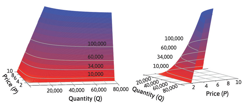
Figure 7.2a Profit as a function of price and quantity for a firm with unit cost of 2.

isoprofit curve
A curve that joins together the combinations of prices and quantities of a good that provide equal profits to a firm.
indifference curve
A curve that joins together all the combinations of goods that provide a given level of utility to the individual.

In Figure 7.2b, we represent profit in two dimensions, by drawing the contours of the profit ‘hill’ on the (Q, P) grid. We call these isoprofit curves (with isoprofit meaning ‘equal profit’): they join together all the (Q, P) points that give the same level of profit.

In this diagram, the horizontal axis displays the quantity of Cheerios in pounds, and ranges from 0 to 80,000. The vertical axis displays the price of Cheerios in dollars per pound, and ranges from 0 to 10. Four, downward-sloping, convex curves which do not intersect with one another are the isoprofit curves for Cheerios. From the upper to the lower curve, the isoprofit curves correspond to profits of $100,000, $60,000, $34,000, and $10,000. A horizontal line at 2 dollars per pound is the isoprofit curve corresponding to $0 profits.
Fullscreen
https://www.core-econ.org/microeconomics/07-firm-and-customers-02-breakfast-cereal.html#figure-7-2b

Figure 7.2b Isoprofit curves for a firm with unit cost of 2.

Zero profits: In this diagram, the horizontal axis displays the quantity of Cheerios in pounds, and ranges from 0 to 80,000. The vertical axis displays the price of Cheerios in dollars per pound, and ranges from 0 to 10. A horizontal curve at 2 dollars per pound is the isoprofit curve for Cheerios, and corresponds to $0 profits.
Fullscreen
https://www.core-econ.org/microeconomics/07-firm-and-customers-02-breakfast-cereal.html#figure-7-2ba

Zero profits

The horizontal line shows values of P and Q where profit is zero: if the price is $2, each pound of cereal is sold for exactly what it cost to make. There would be no profit, whatever the quantity.

Isoprofit curve: $10,000: In this diagram, the horizontal axis displays the quantity of Cheerios in pounds, and ranges from 0 to 80,000. The vertical axis displays the price of Cheerios in dollars per pound, and ranges from 0 to 10. Coordinates are (quantity, price). A horizontal curve at 2 dollars per pound is the isoprofit curve for Cheerios, and corresponds to $0 profits. A downward-sloping convex curve that lies above the zero isoprofit curve and passes through the points (2000, 7), (5000, 4), and (10000, 3) is the isoprofit curve for Cheerios corresponding to profits of $10,000.
Fullscreen
https://www.core-econ.org/microeconomics/07-firm-and-customers-02-breakfast-cereal.html#figure-7-2bb

Isoprofit curve: $10,000

Profit = (P − 2) × Q. You could make $10,000 profit by selling 10,000 pounds at a price of $3, or 5,000 pounds at $4, or 2,000 pounds at $7, or in many other ways. The curve shows all the possible ways of making $10,000 profit.

Isoprofit curve: $60,000: In this diagram, the horizontal axis displays the quantity of Cheerios in pounds, and ranges from 0 to 80,000. The vertical axis displays the price of Cheerios in dollars per pound, and ranges from 0 to 10. Coordinates are (quantity, price). A horizontal curve at 2 dollars per pound is the isoprofit curve for Cheerios, and corresponds to $0 profits. There are two downward-sloping convex curves that lie above the zero isoprofit curve and do not intersect each other. The bottommost curve passes through the points (2000, 7), (5000, 4), and (10000, 3) and is the isoprofit curve corresponding to profits of $10,000. The topmost curve passes through the points (10000, 8), (20000, 5), and (60000, 3) is the isoprofit curve corresponding to profits of $60,000.
Fullscreen
https://www.core-econ.org/microeconomics/07-firm-and-customers-02-breakfast-cereal.html#figure-7-2bc

Isoprofit curve: $60,000

You could make $60,000 profit by selling 60,000 pounds at a price of $3, or 20,000 pounds at $5, or 10,000 pounds at $8, or in many other ways. The curve shows all the combinations of P and Q that give $60,000 profit.

Isoprofit curves slope downward: In this diagram, the horizontal axis displays the quantity of Cheerios in pounds, and ranges from 0 to 80,000. The vertical axis displays the price of Cheerios in dollars per pound, and ranges from 0 to 10. Four, downward-sloping, convex curves which do not intersect with one another are the isoprofit curves for Cheerios. From the upper to the lower curve, the isoprofit curves correspond to profits of $100,000, $60,000, $34,000, and $10,000. A horizontal line at 2 dollars per pound is the isoprofit curve corresponding to $0 profits.
Fullscreen
https://www.core-econ.org/microeconomics/07-firm-and-customers-02-breakfast-cereal.html#figure-7-2bd

Isoprofit curves slope downward

We have drawn two more isoprofit curves. They slope downwards because if two points give the same level of profit, then the point with the higher price must have a lower quantity.

We could describe the isoprofit curves as the firm’s indifference curves: the firm is indifferent between combinations of price and quantity giving the same level of profit.

Question 7.1 Choose the correct answer(s)

A firm’s cost of production is £12 per unit of output. P is the price of the output good and Q is the number of units produced. Using this information, read the following statements and choose the correct option(s).

  • Point (Q, P) = (2,000, 20) is on the isoprofit curve representing the profit level £20,000.
  • Point (Q, P) = (2,000, 20) is on a lower isoprofit curve than point (Q, P) = (1,200, 24).
  • Points (Q, P) = (2,000, 20) and (4,000, 16) are on the same isoprofit curve.
  • Point (Q, P) = (5,000, 12) is not on any isoprofit curve.
  • At (Q, P) = (2,000, 20), profit = (20 – 12) × 2,000 = £16,000.
  • At (Q, P) = (2,000, 20), profit = (20 – 12) × 2,000 = £16,000. At (Q, P) = (1,200, 24), profit = (24 – 12) × 1,200 = £14,400. Therefore, (2,000, 20) is on a higher isoprofit curve.
  • At (Q, P) = (2,000, 20), profit = (20 – 12) × 2,000 = £16,000. At (Q, P) = (4,000, 16), profit = (16 – 12) × 4,000 = £16,000. Therefore, these two points are on the same isoprofit curve.
  • At P = 12 the firm makes no profit. Therefore (5,000, 12) will be on a horizontal isoprofit curve representing zero profit.

Question 7.2 Choose the correct answer(s)

Consider a firm whose unit cost (the cost of producing one unit of output) is the same at all output levels. Using this information, read the following statements and choose the correct option(s).

  • Each isoprofit curve depicts the firm’s profit at different levels of output, for a given price of the output good.
  • Isoprofit curves can be upward-sloping when at high profit levels.
  • Every price–quantity combination lies on an isoprofit curve.
  • Isoprofit curves slope downward when the price is above the unit cost.
  • An isoprofit curve joins all combinations of price and output for which the firm’s profit is the same.
  • If profit is high, the price must be above the unit cost. Then if output is increased, the price has to be reduced to keep the profit level constant. Therefore, isoprofit curves must slope downward.
  • You can calculate the profit for any combination of price and quantity, and draw an isoprofit curve through it by finding other points that give the same profit.
  • If the price is above the unit cost, then if output is increased, the price must be lowered to keep profit constant, so the isoprofit curve slopes downward.

Demand

The firm would like both price and quantity to be high. But if it sets the price too high, no one will want to buy. It needs information about demand: how much potential consumers are willing to pay.

demand curve
A demand curve shows the number of units of a good that buyers would wish to buy at any given price. Also known as: demand function.

Figure 7.3 shows the demand curve for Apple Cinnamon Cheerios, a ready-to-eat breakfast cereal introduced by the firm General Mills in 1989. In 1996, Jerry Hausman, an economist, used data on weekly sales of family breakfast cereals in US cities to estimate how the weekly quantity of cereal that customers in a typical city would wish to buy would vary with its price per pound. For example, Figure 7.3 shows that if the price were $3, customers would demand 25,000 pounds of Apple Cinnamon Cheerios. For most products, the lower the price, the more customers wish to buy.

In this line chart, the horizontal axis displays the quantity of Cheerios in pounds, and ranges from 0 to 80,000. The vertical axis displays the price of Cheerios in dollars per pound, and ranges from 0 to 8. Coordinates are (quantity, price). A downward-sloping, convex curve is the demand curve for Cheerios. The curve passes through the following points: (0, 7), (20,000, 4), (40,000, 2), (60,000, 1) and (80,000, 0.5).
Fullscreen
https://www.core-econ.org/microeconomics/07-firm-and-customers-02-breakfast-cereal.html#figure-7-3

Figure 7.3 Estimated demand for Apple Cinnamon Cheerios.

Adapted from Figure 5.2 in Jerry A. Hausman. 1996. ‘Valuation of New Goods under Perfect and Imperfect Competition’. The Economics of New Goods. Chicago, IL: University of Chicago Press. pp. 207–248.

How economists learn from facts Estimating demand curves using surveys

Jerry Hausman used data on cereal purchases to estimate the demand curve for Apple Cinnamon Cheerios. Another method, particularly useful for firms introducing completely new products, is a consumer survey. Suppose you were investigating the potential demand for space tourism. You could try asking potential consumers:

‘How much would you be willing to pay for a ten-minute flight in space?’

But they may find it difficult to decide, or worse, they may lie if they think their answer will affect the price eventually charged. A better way to find out their true willingness to pay might be to ask:

‘Would you be willing to pay $1,000 for a ten-minute flight in space?’

When this question was asked in 2011, 24.6% of respondents said yes.1

Whether the product is cereal or space flight, the method is the same. If you vary the prices in the question, and ask a large number of consumers, you can estimate the proportion of people willing to pay each price, and hence the whole demand curve.

Maximizing profit

If you were the manager at General Mills, how would you choose the price for Apple Cinnamon Cheerios, and how many pounds of cereal would you produce?

We will assume that the unit cost of Apple Cinnamon Cheerios is $2. Then:

  • Your indifference curves are the ones drawn in Figure 7.2b. To achieve a high profit, you would like both P and Q to be as high as possible (they are both ‘goods’).
  • But you are constrained by the demand curve (Figure 7.3), which determines what is feasible. It shows how many Apple Cinnamon Cheerios consumers are willing to buy at each price. If you choose a high price, you will only be able to sell a small quantity, and if you want to sell a large quantity, you must choose a low price.

Figure 7.4a shows the isoprofit curves and demand curve together. You face a similar problem to Karim, the worker in Unit 3 who wants to choose the point in his feasible set where his utility is maximized. You want to choose a feasible price and quantity that will maximize your profit.

In this diagram, the horizontal axis displays the quantity of Cheerios in pounds, and ranges from 0 to 80,000. The vertical axis displays the price of Cheerios in dollars per pound, and ranges from 0 to 10. Coordinates are (quantity, price). A downward-sloping, convex curve which connects points (0, 7) and (80,000, 1) is the demand curve. The area delimited by the demand curve and the axes is the feasible set. Three, downward-sloping, convex curves which do not intersect one another are the isoprofit curves for Cheerios. From the upper to the lower curve, the isoprofit curves correspond to profits of $60,000, $34,000 and $10,000. The isoprofit curve for $60,000 lies above the demand curve. The isoprofit curve for $34,000 is tangent to the demand curve at point E (14,000, 4.40). The isoprofit curve for $10,000 intersects the demand curve at two points: one is high price and low quantity, the other is low price and high quantity. A horizontal line at 2 dollars per pound is the isoprofit curve corresponding to $0 profits and lies below all the other isoprofit curves.
Fullscreen
https://www.core-econ.org/microeconomics/07-firm-and-customers-02-breakfast-cereal.html#figure-7-4a

Figure 7.4a The profit-maximizing choice of price and quantity for Apple Cinnamon Cheerios.

Demand curve data from Jerry A. Hausman. 1996. ‘Valuation of New Goods Under Perfect and Imperfect Competition’. The Economics of New Goods. Chicago, IL: University of Chicago Press. pp. 207–248.

The profit-maximizing choice: In this diagram, the horizontal axis displays the quantity of Cheerios in pounds, and ranges from 0 to 80,000. The vertical axis displays the price of Cheerios in dollars per pound, and ranges from 0 to 10. Coordinates are (quantity, price). A downward-sloping, convex curve which connects points (0, 7) and (80,000, 1) is the demand curve. The area delimited by the demand curve and the axes is the feasible set. Three, downward-sloping, convex curves which do not intersect one another are the isoprofit curves for Cheerios. From the upper to the lower curve, the isoprofit curves correspond to profits of $60,000, $34,000 and $10,000. The isoprofit curve for $60,000 lies above the demand curve. The isoprofit curve for $34,000 is tangent to the demand curve. The isoprofit curve for $10,000 passes through the point (8,000, 3.25) and intersects the demand curve at two points: one at a higher price and lower quantity, the other at a lower price and higher quantity. A horizontal line at 2 dollars per pound is the isoprofit curve corresponding to $0 profits and lies below all the other isoprofit curves.
Fullscreen
https://www.core-econ.org/microeconomics/07-firm-and-customers-02-breakfast-cereal.html#figure-7-4ab

The profit-maximizing choice

You should find a combination of P and Q on the highest possible isoprofit curve in the feasible set.

It must be on the demand curve: In this diagram, the horizontal axis displays the quantity of Cheerios in pounds, and ranges from 0 to 80,000. The vertical axis displays the price of Cheerios in dollars per pound, and ranges from 0 to 10. Coordinates are (quantity, price). A downward-sloping, convex curve which connects points (0, 7) and (80,000, 1) is the demand curve. The area delimited by the demand curve and the axes is the feasible set. Three, downward-sloping, convex curves which do not intersect one another are the isoprofit curves for Cheerios. From the upper to the lower curve, the isoprofit curves correspond to profits of $60,000, $34,000 and $10,000. The isoprofit curve for $60,000 lies above the demand curve. The isoprofit curve for $34,000 is tangent to the demand curve at point E (14,000, 4.40). The isoprofit curve for $10,000 intersects the demand curve at two points: one is high price and low quantity, the other is low price and high quantity. A horizontal line at 2 dollars per pound is the isoprofit curve corresponding to $0 profits and lies below all the other isoprofit curves.
Fullscreen
https://www.core-econ.org/microeconomics/07-firm-and-customers-02-breakfast-cereal.html#figure-7-4ac

It must be on the demand curve

Any point below the demand curve would be feasible, such as selling 8,000 pounds of cereal at a price of $3.25, but you would make more profit if you raised the price to reach a point on the demand curve.

Maximizing profit at E: In this diagram, the horizontal axis displays the quantity of Cheerios in pounds, and ranges from 0 to 80,000. The vertical axis displays the price of Cheerios in dollars per pound, and ranges from 0 to 10. Coordinates are (quantity, price). A downward-sloping, convex curve which connects points (0, 7) and (80,000, 1) is the demand curve. The area delimited by the demand curve and the axes is the feasible set. Three, downward-sloping, convex curves which do not intersect one another are the isoprofit curves for Cheerios. From the upper to the lower curve, the isoprofit curves correspond to profits of $60,000, $34,000 and $10,000. The isoprofit curve for $60,000 lies above the demand curve. The isoprofit curve for $34,000 is tangent to the demand curve at point E (14,000, 4.40). The isoprofit curve for $10,000 intersects the demand curve at two points: one is high price and low quantity, the other is low price and high quantity. A horizontal line at 2 dollars per pound is the isoprofit curve corresponding to $0 profits and lies below all the other isoprofit curves.
Fullscreen
https://www.core-econ.org/microeconomics/07-firm-and-customers-02-breakfast-cereal.html#figure-7-4ad

Maximizing profit at E

You reach the highest possible isoprofit curve inside the feasible set by choosing point E, where the demand curve is tangent to an isoprofit curve. You should choose P = $4.23, and Q = 15,000 pounds.

Your best strategy is to choose point E in Figure 7.4a. You should produce 15,000 pounds of cereal, and sell it at a price of $4.23 per pound, making $33,450 profit.

constrained choice problem
A problem in which a decision-maker chooses the values of one or more variables to achieve an objective (such as maximizing profit, or utility) subject to a constraint that determines the feasible set (such as the demand curve, or budget constraint).

The profit maximization problem is a constrained choice problem, with the same structure as Karim’s choice of working hours in Unit 3.

  • The decision-maker wants to choose the values of one or more variables to achieve a goal, or objective. For Apple Cinnamon Cheerios, the variables are price and quantity; for Karim, they are consumption and free time.
  • The objective is to optimize something: the worker maximizes utility; the firm maximizes profit; in other models, the firm might minimize costs.
  • The decision-maker faces a constraint that limits what is feasible: Karim’s budget constraint; the demand curve for Apple Cinnamon Cheerios.

In each case, we have represented the decision-maker’s choice graphically, using indifference curves to capture the objective (utility, or profit), and plotting the feasible set of outcomes determined by the constraint. And we have found the solution of the problem at the tangency point of the indifference curves and the constraint.

Constrained choice

A decision-maker chooses the values of one or more variables

  • … to achieve an objective
  • … subject to a constraint that determines the feasible set.

As a manager who cares about profit, your profit-maximizing choice balances two trade-offs between price and quantity:

  • the trade-off you are constrained to make by the demand curve
  • the trade-off you are willing to make on the isoprofit curve (where all points give you the same profit).

The manager at General Mills probably didn’t think about the decision in this way.

Perhaps the price was chosen more by trial and error, informed by past experience and market research. But we expect that a firm will find its way, somehow, to a profit-maximizing price and quantity. The purpose of our economic analysis is not to model the manager’s thought process, but to understand the outcome, and how it depends on the firm’s cost and consumer demand.

Even for an economist, there are other ways to think about profit maximization. In Figure 7.4b, we have calculated how much profit would be made at each point along the demand curve, so that we can find the point where profit is highest.

There are two diagrams. In diagram 1, the horizontal axis displays the quantity of Cheerios in pounds, and ranges from 0 to 80,000. The vertical axis displays the price of Cheerios in dollars per pound, and ranges from 0 to 10. Coordinates are (quantity, price). A downward-sloping, convex curve which connects points (0, 7) and (80,000, 1) is the demand curve. Three, downward-sloping, convex curves which do not intersect one another are the isoprofit curves for Cheerios. From the upper to the lower curve, the isoprofit curves correspond to profits of $60,000, $34,000 and $10,000. The isoprofit curve for $60,000 lies above the demand curve. The isoprofit curve for $34,000 is tangent to the demand curve at point E (15,000, 4.23), which corresponds to point (15,000, 33,450) in diagram 2. The isoprofit curve for $10,000 intersects the demand curve in two points: one is high price and low quantity, the other is low price and high quantity. A horizontal line at 2 dollars per pound is the isoprofit curve corresponding to $0 profits and lies below all the other isoprofit curves. In diagram 2, the horizontal axis displays the quantity of Cheerios in pounds, and ranges from 0 to 80,000. The vertical axis displays profits in dollars, and ranges from -15,000 to 45,000. Coordinates are (quantity, price). A concave curve starts from (0, 0), peaks at (15,000, 33,450), and crosses the horizontal axis at (38,000, 0). The point (15,000, 33,450) corresponds to point E in diagram 1. Profit falls to $0 when the price is equal to the unit cost, $2. This point corresponds to the point in diagram 1 where the isoprofit curve for $0 profit intersects the demand curve. For higher quantities, the profit is negative.
Fullscreen
https://www.core-econ.org/microeconomics/07-firm-and-customers-02-breakfast-cereal.html#figure-7-4b

Figure 7.4b The profit-maximizing choice of price and quantity for Apple Cinnamon Cheerios.

Demand curve data from Jerry A. Hausman. 1996. ‘Valuation of New Goods Under Perfect and Imperfect Competition’. The Economics of New Goods. Chicago, IL: University of Chicago Press. pp. 207–248.

The profit function: There are two diagrams. In diagram 1, the horizontal axis displays the quantity of Cheerios in pounds, and ranges from 0 to 80,000. The vertical axis displays the price of Cheerios in dollars per pound, and ranges from 0 to 10. Coordinates are (quantity, price). A downward-sloping, convex curve which connects points (0, 7) and (80,000, 1) is the demand curve. Three, downward-sloping, convex curves which do not intersect one another are the isoprofit curves for Cheerios. From the upper to the lower curve, the isoprofit curves correspond to profits of $60,000, $34,000 and $10,000. The isoprofit curve for $60,000 lies above the demand curve. The isoprofit curve for $34,000 is tangent to the demand curve. The isoprofit curve for $10,000 intersects the demand curve in two points: one is high price and low quantity, the other is low price and high quantity. A horizontal line at 2 dollars per pound is the isoprofit curve corresponding to $0 profits and lies below all the other isoprofit curves. In diagram 2, the horizontal axis displays the quantity of Cheerios in pounds, and ranges from 0 to 80,000. The vertical axis displays profits in dollars, and ranges from -15,000 to 45,000. Coordinates are (quantity, price). A concave curve starts from (0, 0), peaks at (14,000, 34,000), and crosses the horizontal axis at (38,000, 0).
Fullscreen
https://www.core-econ.org/microeconomics/07-firm-and-customers-02-breakfast-cereal.html#figure-7-4ba

The profit function

Profit = (P – 2) × Q. We calculate profit at each point on the demand curve, and plot it in the lower panel.

Profit at low quantities: There are two diagrams. In diagram 1, the horizontal axis displays the quantity of Cheerios in pounds, and ranges from 0 to 80,000. The vertical axis displays the price of Cheerios in dollars per pound, and ranges from 0 to 10. Coordinates are (quantity, price). A downward-sloping, convex curve which connects points (0, 7), (2160, 6.63), and (80,000, 1) is the demand curve. Three, downward-sloping, convex curves which do not intersect one another are the isoprofit curves for Cheerios. From the upper to the lower curve, the isoprofit curves correspond to profits of $60,000, $34,000 and $10,000. The isoprofit curve for $60,000 lies above the demand curve. The isoprofit curve for $34,000 is tangent to the demand curve. The isoprofit curve for $10,000 intersects the demand curve in two points: one is high price and low quantity, the other is low price and high quantity. A horizontal line at 2 dollars per pound is the isoprofit curve corresponding to $0 profits and lies below all the other isoprofit curves. In diagram 2, the horizontal axis displays the quantity of Cheerios in pounds, and ranges from 0 to 80,000. The vertical axis displays profits in dollars, and ranges from -15,000 to 45,000. Coordinates are (quantity, price). A concave curve starts from (0, 0), passes through (2160, 10000), peaks at (15,000, 33,450), and crosses the horizontal axis at (38,000, 0). When the quantity sold is 2160, profit is $10,000.
Fullscreen
https://www.core-econ.org/microeconomics/07-firm-and-customers-02-breakfast-cereal.html#figure-7-4bb

Profit at low quantities

When Q = 2,160, P = $6.63. Profit is $2,160 × 4.63 = $10,000. Since the quantity is low, so is the profit.

Increasing profits: There are two diagrams. In diagram 1, the horizontal axis displays the quantity of Cheerios in pounds, and ranges from 0 to 80,000. The vertical axis displays the price of Cheerios in dollars per pound, and ranges from 0 to 10. Coordinates are (quantity, price). A downward-sloping, convex curve which connects points (0, 7) and (80,000, 1) is the demand curve. Three, downward-sloping, convex curves which do not intersect one another are the isoprofit curves for Cheerios. From the upper to the lower curve, the isoprofit curves correspond to profits of $60,000, $34,000 and $10,000. The isoprofit curve for $60,000 lies above the demand curve. The isoprofit curve for $34,000 is tangent to the demand curve. The isoprofit curve for $10,000 intersects the demand curve in two points: one is high price and low quantity, the other is low price and high quantity. A horizontal line at 2 dollars per pound is the isoprofit curve corresponding to $0 profits and lies below all the other isoprofit curves. In diagram 2, the horizontal axis displays the quantity of Cheerios in pounds, and ranges from 0 to 80,000. The vertical axis displays profits in dollars, and ranges from -15,000 to 45,000. Coordinates are (quantity, price). A concave curve starts from (0, 0), peaks at (15,000, 33,450), and crosses the horizontal axis at (38,000, 0). As the quantity sold increases until 15,000, so does the profit.
Fullscreen
https://www.core-econ.org/microeconomics/07-firm-and-customers-02-breakfast-cereal.html#figure-7-4bc

Increasing profits

As quantity increases, profit rises until …

Maximum profits: There are two diagrams. In diagram 1, the horizontal axis displays the quantity of Cheerios in pounds, and ranges from 0 to 80,000. The vertical axis displays the price of Cheerios in dollars per pound, and ranges from 0 to 10. Coordinates are (quantity, price). A downward-sloping, convex curve which connects points (0, 7) and (80,000, 1) is the demand curve. Three, downward-sloping, convex curves which do not intersect one another are the isoprofit curves for Cheerios. From the upper to the lower curve, the isoprofit curves correspond to profits of $60,000, $34,000 and $10,000. The isoprofit curve for $60,000 lies above the demand curve. The isoprofit curve for $34,000 is tangent On the to the demand curve at point E (15,000, 4.23) is shown, which corresponds to point (15,000, 33,450) in diagram 2. The isoprofit curve for $10,000 intersects the demand curve in two points: one is high price and low quantity, the other is low price and high quantity. A horizontal line at 2 dollars per pound is the isoprofit curve corresponding to $0 profits and lies below all the other isoprofit curves. In diagram 2, the horizontal axis displays the quantity of Cheerios in pounds, and ranges from 0 to 80,000. The vertical axis displays profits in dollars, and ranges from -15,000 to 45,000. Coordinates are (quantity, price). A concave curve starts from (0, 0), peaks at (15,000, 33,450), and crosses the horizontal axis at (38,000, 0). The point (15,000, 33,450) corresponds to point E in diagram 1.
Fullscreen
https://www.core-econ.org/microeconomics/07-firm-and-customers-02-breakfast-cereal.html#figure-7-4bd

Maximum profits

… profit reaches a maximum of $33,450 at E, where Q = 15,000 and P = 4.23.

Falling profits: There are two diagrams. In diagram 1, the horizontal axis displays the quantity of Cheerios in pounds, and ranges from 0 to 80,000. The vertical axis displays the price of Cheerios in dollars per pound, and ranges from 0 to 10. Coordinates are (quantity, price). A downward-sloping, convex curve which connects points (0, 7) and (80,000, 1) is the demand curve. Three, downward-sloping, convex curves which do not intersect one another are the isoprofit curves for Cheerios. From the upper to the lower curve, the isoprofit curves correspond to profits of $60,000, $34,000 and $10,000. The isoprofit curve for $60,000 lies above the demand curve. The isoprofit curve for $34,000 is tangent to the demand curve at point E (15,000, 4.23) is shown on the demand curve, which corresponds to point (15,000, 33,450) in diagram 2. The isoprofit curve for $10,000 intersects the demand curve in two points: one is high price and low quantity, the other is low price and high quantity. A horizontal line at 2 dollars per pound is the isoprofit curve corresponding to $0 profits and lies below all the other isoprofit curves. In diagram 2, the horizontal axis displays the quantity of Cheerios in pounds, and ranges from 0 to 80,000. The vertical axis displays profits in dollars, and ranges from -15,000 to 45,000. Coordinates are (quantity, price). A concave curve starts from (0, 0), peaks at (15,000, 33,450), and crosses the horizontal axis at (38,000, 0). The point (15,000, 33,450) corresponds to point E in diagram 1. For quantities higher than at E, profit falls.
Fullscreen
https://www.core-econ.org/microeconomics/07-firm-and-customers-02-breakfast-cereal.html#figure-7-4be

Falling profits

Beyond E, the profit falls. More cereal is sold, but there is less profit on each unit. Profit is zero when the price is equal to the unit cost, $2.

Negative profits: There are two diagrams. In diagram 1, the horizontal axis displays the quantity of Cheerios in pounds, and ranges from 0 to 80,000. The vertical axis displays the price of Cheerios in dollars per pound, and ranges from 0 to 10. Coordinates are (quantity, price). A downward-sloping, convex curve which connects points (0, 7) and (80,000, 1) is the demand curve. Three, downward-sloping, convex curves which do not intersect one another are the isoprofit curves for Cheerios. From the upper to the lower curve, the isoprofit curves correspond to profits of $60,000, $34,000 and $10,000. The isoprofit curve for $60,000 lies above the demand curve. The isoprofit curve for $34,000 is tangent to the demand curve at point E (15,000, 4.23), is shown on the demand curve which corresponds to point (15,000, 33,450) in diagram 2. The isoprofit curve for $10,000 intersects the demand curve in two points: one is high price and low quantity, the other is low price and high quantity. A horizontal line at 2 dollars per pound is the isoprofit curve corresponding to $0 profits and lies below all the other isoprofit curves. In diagram 2, the horizontal axis displays the quantity of Cheerios in pounds, and ranges from 0 to 80,000. The vertical axis displays profits in dollars, and ranges from -15,000 to 45,000. Coordinates are (quantity, price). A concave curve starts from (0, 0), peaks at (15,000, 33,450), and crosses the horizontal axis at (38,000, 0). The point (15,000, 33,450) corresponds to point E in diagram 1. Profit falls to $0 when the price is equal to the unit cost, $2. This point corresponds to the point in diagram 1 where the isoprofit curve for $0 profit intersects the demand curve.
Fullscreen
https://www.core-econ.org/microeconomics/07-firm-and-customers-02-breakfast-cereal.html#figure-7-4bf

Negative profits

To sell a very high quantity, the price has to be lower than the unit cost, so profit is negative.

The profit-maximizing choice: There are two diagrams. In diagram 1, the horizontal axis displays the quantity of Cheerios in pounds, and ranges from 0 to 80,000. The vertical axis displays the price of Cheerios in dollars per pound, and ranges from 0 to 10. Coordinates are (quantity, price). A downward-sloping, convex curve which connects points (0, 7) and (80,000, 1) is the demand curve. Three, downward-sloping, convex curves which do not intersect one another are the isoprofit curves for Cheerios. From the upper to the lower curve, the isoprofit curves correspond to profits of $60,000, $34,000 and $10,000. The isoprofit curve for $60,000 lies above the demand curve. The isoprofit curve for $34,000 is tangent to the demand curve at point E (15,000, 4.23), which corresponds to point (15,000, 33,450) in diagram 2. The isoprofit curve for $10,000 intersects the demand curve in two points: one is high price and low quantity, the other is low price and high quantity. A horizontal line at 2 dollars per pound is the isoprofit curve corresponding to $0 profits and lies below all the other isoprofit curves. In diagram 2, the horizontal axis displays the quantity of Cheerios in pounds, and ranges from 0 to 80,000. The vertical axis displays profits in dollars, and ranges from -15,000 to 45,000. Coordinates are (quantity, price). A concave curve starts from (0, 0), peaks at (15,000, 33,450), and crosses the horizontal axis at (38,000, 0). The point (15,000, 33,450) corresponds to point E in diagram 1. Profit falls to $0 when the price is equal to the unit cost, $2. This point corresponds to the point in diagram 1 where the isoprofit curve for $0 profit intersects the demand curve. For higher quantities, the profit is negative.
Fullscreen
https://www.core-econ.org/microeconomics/07-firm-and-customers-02-breakfast-cereal.html#figure-7-4bg

The profit-maximizing choice

The lower panel shows that profit is maximized at E. As indicated on the isoprofit curves, this is the tangency point we found before.

The graph in the lower panel is the profit function: it shows the profit you would achieve if you chose to produce a quantity, Q, and set the highest price that would enable you to sell that quantity. And it tells us, again, that you would achieve the maximum profit at point E.

Question 7.3 Choose the correct answer(s)

The table represents demand Q for a good at different prices P.

Q 100 200 300 400 500 600 700 800 900 1,000
P £270 £240 £210 £180 £150 £120 £90 £60 £30 £0

The firm’s unit cost of production is £60. Using this information, read the following statements and choose the correct option(s).

  • At Q = 100, the firm’s profit is £20,000.
  • The profit-maximizing output is Q = 400.
  • At Q = 300, the firm’s profit is higher than at Q = 500.
  • The firm will make a loss at all outputs of 800 and above.
  • At Q = 100, profit = (270 – 60) × 100 = £21,000.
  • At Q = 400, profit = (180 – 60) × 400 = £48,000. If you calculate the profit for each point on the demand curve you will find that profit is lower at the other points.
  • The profit is the same at both points: At Q = 300, profit = (210 – 60) × 300 = £45,000. At Q = 500, profit = (150 – 60) × 500 = £45,000.
  • The firm will make a loss (negative profit) at all outputs above 800. At exactly 800, the profit is zero.

Exercise 7.1 Changes in the market

Draw diagrams to show how the curves in Figure 7.4a would change in each of the following cases. To make sketching the curves easier, assume the demand curve is linear. In each case, explain what would happen to the firm’s price and its profit.

  1. A rival firm producing a similar brand reduces its prices.
  2. The cost of producing Apple Cinnamon Cheerios rises to $3 per pound.
  3. A well-publicized government study shows that General Mills’ products are healthier than other breakfast cereals.
  1. ‘Willingness to Pay for a Flight in Space’. Statista. Updated 20 October 2011.