Unit 9 Uneven development on a global scale
9.9 Growth transitions
In this section and the next, we use the growth dynamics model from the previous section to shed light on why some initially poor countries have achieved high growth rates for several decades, while others have not. The countries include South Korea, Bangladesh, Botswana, Pakistan, and Tanzania. But first, we return to the growth of the US over the century from 1890 to 1990, shown initially in Figure 9.6b in Section 9.3. In that figure, we used the production function to interpret the comparative data for a set of countries, including the US. Here, we analyse the same data through the lens of the growth dynamics model.

Figure 9.18 Rapid growth associated with a high value of \(𝛽\), 1940s–1960s in the United States.
Robert C. Allen. 2012. ‘Technology and the Great Divergence: Global Economic Development Since 1820’. Explorations in Economic History. 49(1): pp. 1–16. Note: the dots refer to decadal data unless otherwise indicated.
The upper panel of Figure 9.18 reproduces from Figure 9.6b the data for the US from 1890 to 1990 with the capital per worker on the horizontal axis and output per worker on the vertical axis. It shows that in the 27 years between 1939 and 1966, capital intensity and output per worker increased much faster than in the preceding 50 years, or subsequently. The lower panel shows that this burst of rapid growth was associated with an increase in the growth of output produced by the increase in capital stock (that is, \(\beta\) in the growth dynamics model of Section 9.8) from less than one to more than 2.5. The value of \(\beta\) is calculated as the slope of the curve in the upper panel (\(\beta = \Delta Y / \Delta K\)).
This evidence suggests that there are conditions under which investing now may have a very substantial effect on subsequent growth. So \(\beta\) may take a value much greater than 1 (as in the figure), and we could have \(\alpha\beta > 1\), even if less than all of growth was invested (for example, if \(\beta = 2.5\), then \(\alpha\beta > 1\) if \(\alpha > 0.4\)). The wartime and immediate postwar growth in the US put it on a path of rapid (although not disequilibrium) growth, but this was relatively short-lived. In interpreting the growth data through the lens of the growth dynamics model, we note that the measured \(\Delta Y / \Delta K\) will reflect any uptick in the rate of exogenous growth as well as a rise in \(\beta\).
Next, we turn to growth since 1960 for a number of countries—some of which succeeded in growing fast and others which did not. We have chosen the countries shown in Figure 9.19 to illustrate the concepts introduced earlier in the unit. Countries illustrating ‘hockey stick’ growth after 1960 include South Korea, China, and India, as well as Botswana and Bangladesh. The growth failures are Argentina and Mexico, which grew no faster than the US, and Tanzania and Pakistan, which did not achieve sustained hockey stick growth. We use the ratio scale for GDP per capita so that we can observe both relative levels of GDP per capita and growth rates. As we saw in Section 9.2, relative growth rates are shown by the slopes of the data series. The US is included in Figure 9.19 to illustrate the remaining GDP per capita gaps from the US for the countries in the sample.

Figure 9.19 GDP per capita using the ratio scale, 1960–2023.
Jutta Bolt and Jan Luiten van Zanden. 2024. ‘Maddison-Style Estimates of the Evolution of the World Economy: A New 2023 Update’. Journal of Economic Surveys: pp. 1–41.
- median
- When a set of observations is arranged in order, the median is in the middle: half of the observations are above it, and half below. (More precisely, if the number of observations is odd, the median is the value of middle observation; if the number of obeservations is even, the median is the value halfway between the two middle observations.)
The earlier sections of this unit raise the question of how the countries with such varying growth performance compare in their shares of investment in GDP? Figure 9.20 shows investment as a share of GDP for the same set of countries as in Figure 9.19, from 1980 to 2023. The immediate impression is to confirm the wide variation in investment shares that we saw in Figure 9.11. The investment share in the US—the technology leader over this period—tracks the global median investment share until the mid-2000s, after which it falls below the median. As shown in the model in Section 9.4, having achieved a high level of GDP per capita through rapid growth, a country can sustain that level with a modest growth rate and a low share of investment relative to countries that are growing fast.

Figure 9.20 Investment shares, 1980–2023, selected countries and world median.
Argentina and Mexico are two poor performers in Figure 9.19, beginning much richer than the other countries but failing to achieve sustained rapid growth in the last six decades. Consistent with their failure to achieve high growth rates are the low investment shares of both countries shown in Figure 9.20. Mexico tracks the world median and Argentina’s investment share is well below the median throughout.
We do not analyse these countries in detail but a starting point for further investigation would be poor macroeconomic management, which reflected conflicts over the distribution of income (read Unit 7 of the macroeconomics volume and CORE Insights from the Global South (Government Debt and Sovereign Wealth in the Global South and The Sky’s the Limit: The Economics of Inflation and Hyperinflation)). These distributional conflicts and the macroeconomic volatility associated with them are likely to be part of the explanation for the comparatively low incentive to invest (which in the terminology of the growth dynamics model would be captured by low \(𝛼\)) and the weak returns from the investment that did occur (low \(𝛽\) in both countries).
Botswana and Tanzania
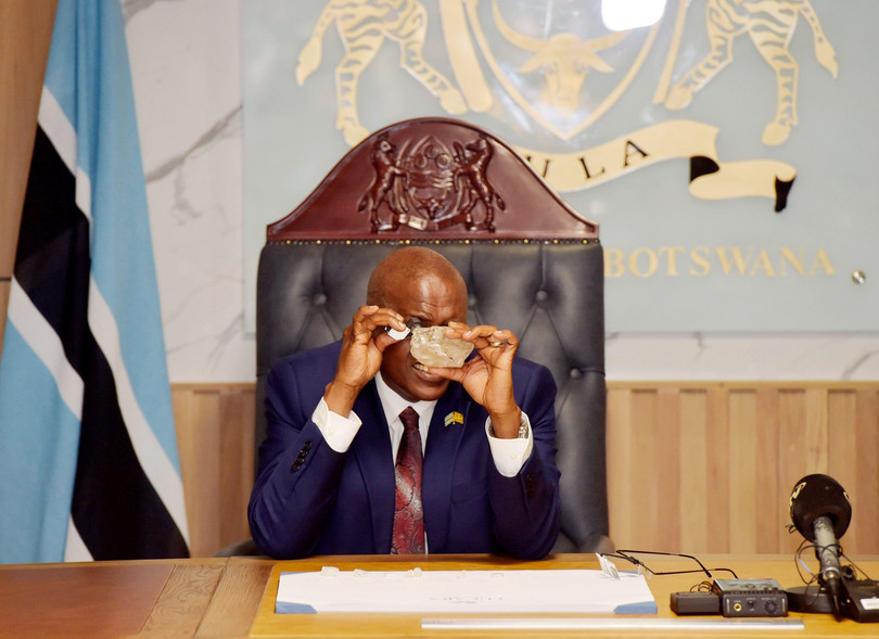
Botswanan President Mokgweetsi Masisi inspects the 2,492-carat diamond discovered in the Karowe Diamond Mine in north-central Botswana, in Gaborone, Botswana, on Aug. 22, 2024.
‘I can see roads being built, I see hospitals and I can see kids going to school …’ Botswana’s President Mokgweetsi Masisi wasn’t reading the future in a crystal ball, but in the 2,492-carat diamond discovered in August 2024 at the Karowe mine in central Botswana. He knows the profit his country of 2.7 million inhabitants will reap from the sale of this gem, estimated at over $40 million. According to several experts, the half-kilogram stone is the second-largest diamond ever found, and the largest in a century. Botswana has only been producing diamonds since 1971 and sales account for a quarter of the country’s GDP, but falling global prices are forcing it to diversify its economy.
Botswana was one of the poorest countries in the world in 1960. Yet by 2024, its GDP per capita was similar to Mexico’s, a country that began the period with more than eight times higher income. Botswana succeeded in establishing a high growth equilibrium as described in the previous section, with annual growth of 7.6% between 1965 and 2000 and annual growth of 3.3% over the last quarter century. Tanzania was almost equally poor in 1960 and did not grow for 40 years from 1960.
Was it the diamonds that enabled Botswana to achieve high growth over an extended period? Although it sounds plausible, economists have documented that a major natural resource discovery can bring with it negative consequences, hindering balanced economic development. Possible consequences are the capture of the resource rents by elites, which entrenches their power, or political instability arising from conflict over the control of the natural resource.
Botswana stands out as the exception among the resource-rich countries of Africa (including Angola, Democratic Republic of Congo, Sierra Leone, and Nigeria), where civil wars or intense infighting over control of resource revenues have blighted development. To understand how Botswana avoided the resource curse and was able to put its windfall to use in raising living standards, we need to return to the role of institutions. But first, we compare investment shares between Botswana and Tanzania.

Figure 9.21 Growth and investment in Botswana and Tanzania.
Jutta Bolt and Jan Luiten van Zanden. 2024. ‘Maddison-Style Estimates of the Evolution of the World Economy: A New 2023 Update’. Journal of Economic Surveys: pp. 1–41.; IMF World Economic Outlook 2024.
From their relative growth rates, we might have guessed that Botswana would have a higher investment share than Tanzania—but as Figure 9.21 (right panel) shows, Tanzania invested a higher share of its GDP than did Botswana for almost the entire period since 1980. How did Botswana achieve and sustain a high growth equilibrium with a relatively low investment share?
Equally puzzling is why Tanzania, with an investment share above the world median throughout and rising since 2000 towards 40%, has found sustained growth elusive. These two countries highlight the dispersion in the relationship between the investment share and GDP per capita illustrated in Figure 9.11. Comparing the panels in Figure 9.21 shows that Tanzania’s growth rate was falling over the last 15 years in spite of a sharply rising share of investment.
One very striking feature of Botswana’s economic development is the creation of a relatively well-educated population. From 1980 to 2000, average years of schooling tripled, in sharp contrast to the slow improvement in Tanzania (Figure 9.22). But this is more likely to have been a consequence than a cause of the contrasting growth paths of these countries. More important for its growth were policy choices and the quality of its institutions.

Figure 9.22 Average years of schooling, 1960–2020, selected countries, ratio scale.
L. Prados de la Escosura. 2021. ‘Augmented Human Development in the Age of Globalisation’ Economic History Review.
Botswana: Economic growth and stability
Botswana became independent from Britain in 1966 and subsequently became one of the fastest-growing countries in the world. In their research published as ‘An African Success Story: Botswana’, Acemoglu, Johnson, and Robinson (2003) highlight the role played in post-independence growth by the persistence of good pre-colonial tribal institutions, including the rule of law and deliberative forums that allowed participation by all males in decision-making. Importantly, the British did not have a strong interest in Botswana (diamonds were only discovered in 1971), which meant that the local institutions conducive to growth survived its period as a British protectorate.
On independence, the government began to implement development plans that prioritized investment in infrastructure, health, and education. This was supported by the political elites from the rural areas—cattle owners made up the majority of members of the National Assembly and were keen to enforce property rights and benefit from government investment in rural infrastructure.
Once diamonds were discovered, the governing political elite, which already benefited from secure collective property rights (in cattle ranching), did not seek to expropriate the revenue from diamond mining. The resource rents were invested in a sovereign wealth fund, which invests in a variety of assets globally and was managed well. A small manufacturing sector has grown in line with GDP, with a share of 5%, and the tourism industry has become increasingly important.
Collier says that De Beers had informed President Khama that there were diamonds in the territory of his clan. He prioritized national development over his clan’s interests.
Botswana’s resource windfall offered the opportunity for investment without the need to reduce the level of consumption of the population. The challenge was to take advantage of the opportunity and not squander it through divisive disputes among the different tribal groups. As reported by Paul Collier (2024), on learning from the prospecting by the diamond mining company, De Beers, that discoveries were likely but prior to knowing where diamonds might be found, the President of Botswana, Seretse Khama, asked all of the clan leaders: if diamonds were discovered, should they be shared by the entire nation or should they belong to the clan on whose territory they were found? Behind this ‘veil of ignorance’, they agreed to share. This provided the framework for Botswana’s decades of rapid growth.
In spite of its success in growth and stability, Botswana is one of the most unequal countries in the world, ranking in the top 10 among the 164 countries in the World Bank Group’s database of Gini coefficients measuring inequality of per capita consumption. According to this measure, the Gini coefficient in 2015 was 0.55 (for comparison, using the same measure, it was 0.59 in South Africa). This level of inequality in consumption persists in spite of one of the highest levels of redistribution through the tax and transfer system in the world: the pre-tax-and-transfer Gini is 0.13 higher. In the mid-2020s, disparities in post-secondary education remain high, wealth is very unequally distributed, and the unemployment rate averages 20%.
Tanzania: Low economic growth
In Figure 9.21, we noted that Tanzania’s investment share was above the world median from independence (in 1961) onwards—and higher than Botswana’s share throughout. Yet Tanzania did not grow. President Julius Nyerere’s growth strategy was based on raising the investment share to provide the resources for economic transformation that would create a modern sector of the economy and lift the population out of poverty. We have argued that increasing investment without having to reduce consumption is likely to be more successful, but Nyerere didn’t have that option.
He accepted the premise that consumption would have to fall. He was able to reduce consumption through the following mechanism: the government bought export crops like coffee from farmers and paid them well below world prices. The difference in price was a form of tax revenue for the government, which could be devoted to investment. In contrast to many postcolonial leaders, Nyerere made sacrifices himself to establish the moral authority to get the consent of the population to embark on this ‘pain now, gain later’ strategy (symbolic of his own restraint was his refusal to live in the official governor’s mansion or use the Rolls-Royce left when the British departed).
Consumption was squeezed, and revenue was collected and channelled into public investment. But this failed to produce the rapid growth Nyerere had promised. One way to interpret the failure of the strategy for growth in Tanzania is that it relied on a variant of economic planning that shielded (the mainly state-owned) domestic producers from competition by adopting a policy to invest in producing substitutes for imported manufactured goods rather than incentivizing firms to sell abroad.
In contrast to the model in Section 9.6, where missing public investment in infrastructure prevented the coordination of private investment on a high investment equilibrium, in this case, most enterprises were state-owned and investment decisions were directed by the state, which focused on producing goods that substituted for imports. We will contrast this policy with what happened in Bangladesh in the next section.
The policy also struggled in the short run because scarce foreign currency was used to purchase capital goods for the import-substituting manufacturing activities in Nyerere’s growth plan. This left households and firms across the economy unable to purchase the imported oil they required. Production fell in industry and agriculture. Shortages arose, creating the conditions for corruption, and, as a consequence, the government lost the moral high ground.
Over the course of the 1970s, the industrialization strategy failed spectacularly: high investment rates were associated with falling productivity caused mainly by extremely low capacity utilization. Having installed capital goods in manufacturing, an average rate of capacity utilization of only 30% was achieved in the 1970s, and it fell to below 10% in textile mills in the 1980s. A shoe factory built with finance from overseas donors and intended for export reportedly never used more than 4% of the installed capacity.1 Given the high fixed costs and low sales, firms depended on state subsidies to survive. The government was unable to monitor and control the use of resources in manufacturing, and there was no discipline from market competition. Several cases of ‘grand corruption’ involving state officials were documented.
A different strategy for industrial development was adopted in 1996, which was based on privatization, encouraging foreign direct investment and setting up ‘export processing zones’. Although combinations of these policies were observed in other countries that were successful in creating flourishing labour-intensive manufacturing sectors, this did not happen in Tanzania.
Interpreting the contrasting trajectories of Botswana and Tanzania through the lens of the growth dynamics model of Figure 9.17 focuses attention on \(𝛼\) (the investment rule) and \(𝛽\) (the productivity of the additional capital stock). The model suggests that Nyerere’s strategy was to shift Tanzania from a low- to a high-growth equilibrium by raising the share of last period’s output invested (\(𝛼\)) and indeed, this was achieved. In the model, failure to achieve the high growth equilibrium could arise because of an offsetting fall in the additional output produced by the additional capital stock (\(\beta\)). \(𝛽\) likely fell in Tanzania because of the short- and long-run effects on GDP of the flawed policy of import substitution and the deterioration in institutional quality (increase in corruption, for example) that accompanied its failure—and the failure of subsequent rounds of reforms.
By contrast, Botswana had the good fortune to be able to increase growth without raising its investment share because of the resource rents from diamond extraction. By managing this windfall well through good policies and high-quality institutions, a lasting increase in \(𝛽\) was achieved and the high growth equilibrium sustained for decades.

Figure 9.23 The contrast between the low-growth equilibrium in Tanzania and the high-growth equilibrium in Botswana using the growth dynamics model of Figure 9.17a.
Exercise 9.11 Modelling economic growth (Part 1)
Choose one country shown in Figure 9.22. Draw a growth dynamics model diagram similar to Figure 9.23, showing the initial (the year 1960), planned, and actual growth (latest year available), that is consistent with the following data on that country:
- GDP per capita
- investment as a percentage of GDP
- average years of schooling.
(If data on your chosen country is not shown in Figures 9.19 and 9.20, download it from the original source listed underneath the figure.)
-
Gray, Hazel. 2013. ‘Industrial Policy and the Political Settlement in Tanzania: Aspects of Continuity and Change Since Independence’. Review of African Political Economy 40(136): pp. 185–201. ↩
