Unit 9 Uneven development on a global scale
Why some countries are rich and others are poor, and how planetary limits affect growth and inequality
9.1 The transformation of China’s economy and living standards

Yuan Yang, Member of Parliament (official portrait 2024)
Yuan Yang is the first Chinese-born Member of Parliament in the UK. At the age of four, in 1994, she left China to join her parents who were both studying for PhDs in England. At university, she studied economics and was co-founder of the student-led Rethinking Economics movement. In 2016, she returned to China as a journalist with the Financial Times and spent the next six years reporting from there. Her book Private Revolutions: Coming of Age in a New China, published in 2024, tells the story of June, a woman of a similar age living through China’s capitalist revolution.
Yuan Yang begins the story of June at age 13, in 2009. June had travelled for a day from her village to identify the body of her mother, who had died in a coal-mining accident. Her mother was the main breadwinner, living far from their village, where her disabled father was a peasant farmer. Her mother’s job at the mine enabled the family to borrow money to buy bricks and concrete and build a new house, replacing the one made of branches and thatch.
June’s sister May was five years older than June. By the time of their mother’s death, May was working in a garment factory in Zhejiang province to the south of Shanghai, having left home at fifteen. Her wages supported June through the rest of her schooling. June did well at middle school and went on to high school and to the national competition (gaokao) for university entry. She was one of the 40 million students (but the only one from her middle school) who got a university place—in her case, at the provincial university. Entry to elite Chinese universities is more competitive than entry to Harvard.
June entered the job market in the COVID-19 pandemic and applied for hundreds of jobs. It was the peak of China’s boom in online tutoring—the edtech sector was taking off—and June got a job in a Beijing-based startup that was listed on the New York Stock Exchange. The demand for tutoring came from parents desperate for their children to succeed in the scramble for places at better schools and universities; the supply of tutors came from the big inflow of graduates to the labour market looking for work. The recruitment process was lengthy, involving three rounds of interviews and a week of online training and tests—her experience resembles the search and matching model described in The Economy 2.0: Microeconomics Unit 6, and that of many graduating students around the world. Her wage was high enough to allow her to share a two-bedroom flat in the high-rise tech district of Beijing.
The edtech sector in China crashed in 2021 when the government banned for-profit tutoring for students in compulsory education. June began looking for another job and joined the operations team of a giant delivery services app.
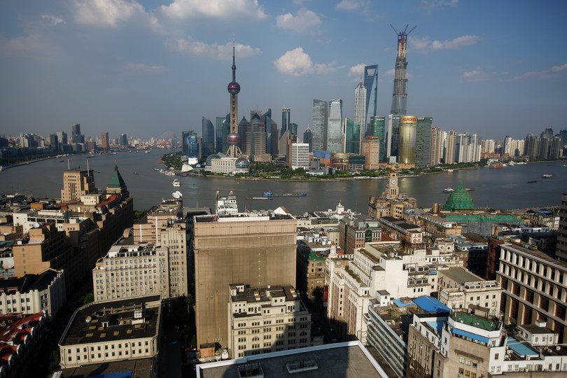
June’s and May’s lives from the 1990s through to the 2020s reflect the transformation of China, which is graphically illustrated by the changing skyline of Shanghai in Figure 9.1. In 1987, three years before Yuan Yang was born, the skyline in Shanghai looked like the image in the top panel, by the time she was 23 it looked like the image in the bottom panel.
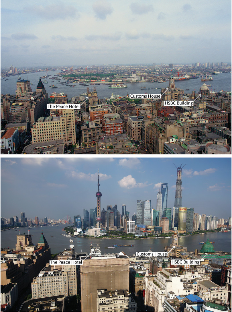
Figure 9.1 Shanghai skyline with the Bund in the foreground and Pudong in the background, 1987 and 2013. The Peace Hotel, Customs House, and the HSBC building on the Bund are marked in both images.
- decile
- A subset of observations, formed by ordering the full set of observations according to the values of a particular variable, and then splitting the set into ten equally-sized groups. For example, the 1st decile refers to the smallest 10% of values in a set of observations.
In the ‘skyscraper’ figures in Figure 9.2, countries are ordered from left to right according to their average incomes with those with lowest per capita income on the left (coloured in red in 1980). The width of each country’s block represents the size of its population. With their large populations, China and India have wide blocks. Within each country, the average income is shown for each decile group, with the richest decile group at the back.
Watching the animated version of this figure, which begins in 1980 (the top panel in Figure 9.2) with the poorest countries coloured red, the wide red block of China moves past countries that in 1980 had much higher incomes (coloured orange, yellow, and green). By 1987 (the year corresponding to the first photograph of Shanghai), average incomes in China exceeded those in India and Indonesia; by 2013 (when the second photograph of Shanghai was taken), China had moved from being one of the poorest countries on earth to a position around the middle of the distribution of countries.
Extreme poverty has declined in the world excluding China as well as in China. Follow this link for the comparison for the period from 1990 to 2022.
Given its size, China’s growth played a major role in the fall in the share of the world’s population living in extreme poverty over this period.

Figure 9.2 The ‘skyscraper’ representation of global incomes by country, 1980 and 2020.
Along with virtually every country in the world, the gradient of China’s income decile blocks gets steeper and steeper as the years go by. Compare the height of the top decile relative to the bottom one in 2013 and 1987 (in the animated version), or in 2020 and 1980 (in Figure 9.2). This signals a large increase in inequality in China over this period of rapid growth.
In this unit, we will examine some ways in which countries have managed to grow economically, and why some countries have grown faster than others—and some hardly at all.
Exercise 9.1 Visualizing income growth
Go to our interactive visualization, which contains the data used to create Figure 9.2. Choose five countries that you are interested in.
- In the visualization, use the ‘Skyscraper plot’ tab to display the income distributions in 1980, 2000, and 2020 for your chosen countries. Save these images (for example, as screenshots).
- Using the skyscraper plots you made in Question 1, describe the differences between countries and the changes over time that you find.
- Suggest some explanations for your answers to Question 2. You may find it helpful to conduct some internet research to support your answers.
How to cite this unit
Wendy Carlin, Samuel Bowles, Stephen Margaret Stevens, and Olivia Osei-Twumasi. (2025). ‘Uneven development on a global scale’. Unit 9 in The CORE Econ Team, The Economy 2.0: Macroeconomics. Available at https://books.core-econ.org/the-economy/microeconomics/01-prosperity-inequality-01-ibn-battuta.html. [Accessed on (date)].
